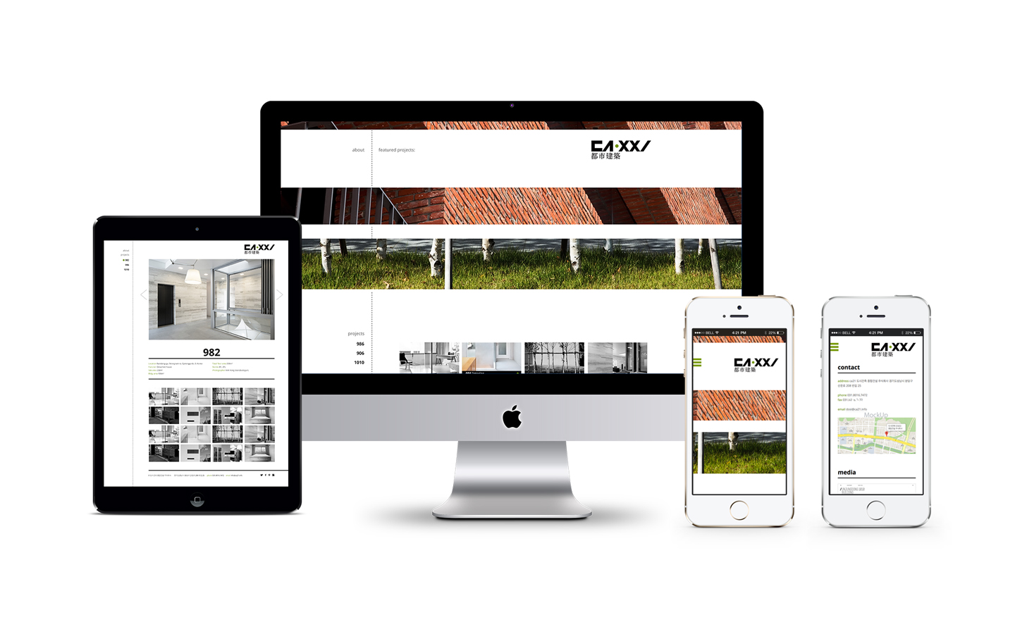
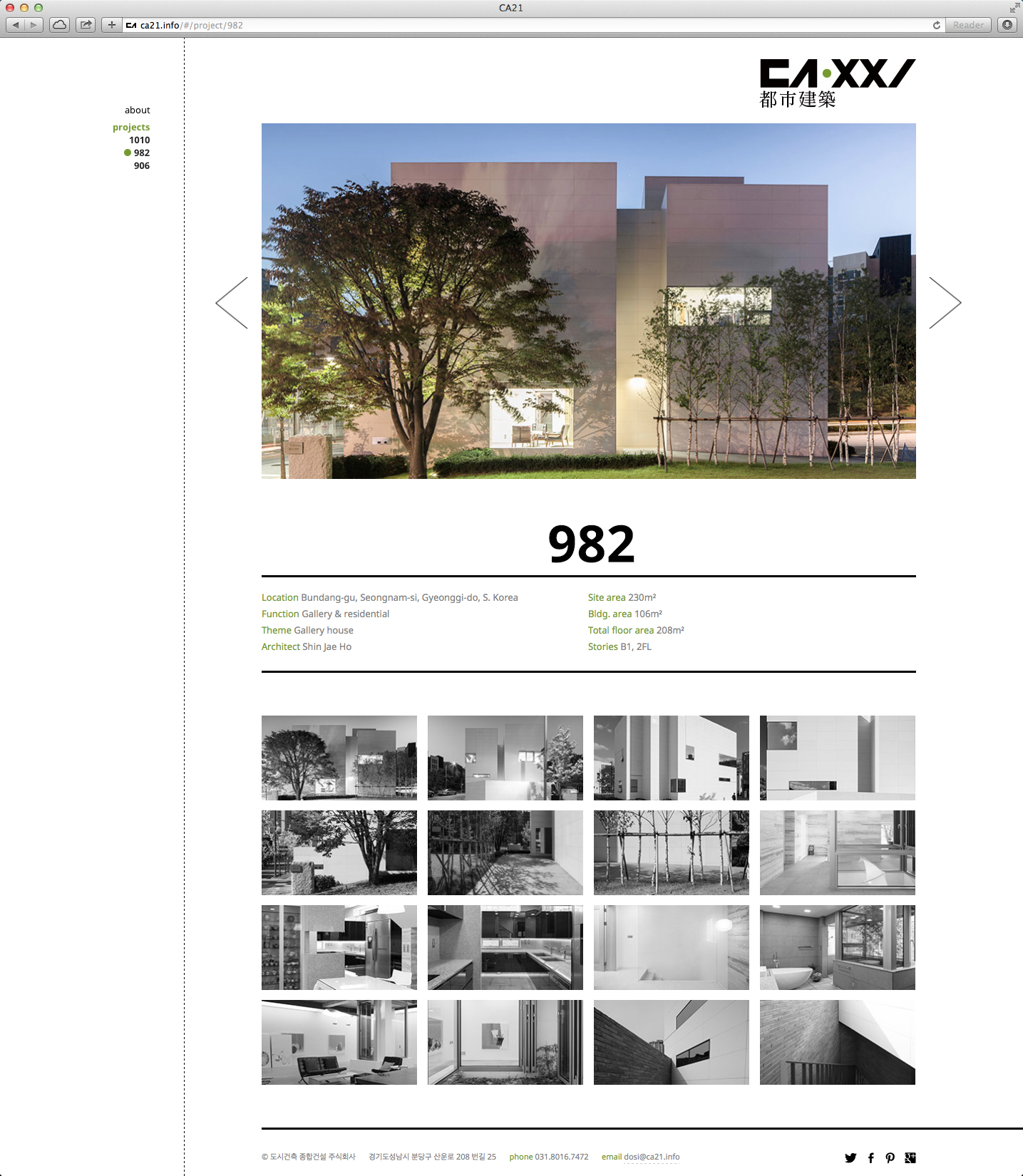
City Architecture Identity and Website Design
City Architecture’s logotype was designed based on a modified version of the nine palaces grid and modular system. This non-decorative, straightforward approach echoes the aesthetic experience of this Korean architecture firm’s artistic creations. The green dot embedded in the logo serves a symbol of the human-center and environmental friendly design approach. This simple yet sophisticated brand identity system is carried throughout all design communications.
Award and Honor:
W3 Silver Award
Communicator Silver Award
Deliverables: logo design, visual identity system, website.